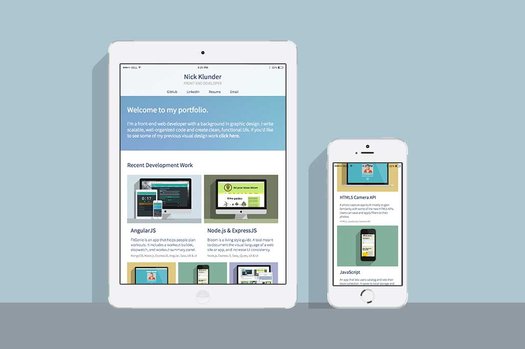
Responsive Grid System
The responsive grid adapts gracefully to any screen. The multi-column layout breaks down to a 1-column view on mobile, maximizing screen space.
User Experience
Your time is valuable and I don't want to waste it. This website was designed to give you the information you need in concise, bite-sized chunks.