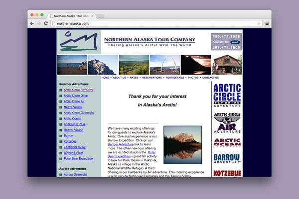
Previous Design
The original site was built using a fixed width table layout, making it horrible for SEO and not adaptable to today's wide variety of devices and screen sizes.
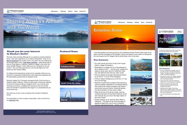
Redesign – Responsive
The redesign brings the site up to date with current design trends. Multiple breakpoints allow for a great browsing experience on any size screen.
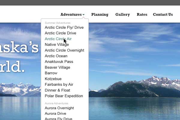
Improved Navigation
The adventure menu now sits on the top nav bar – always available to the user. This frees up valuable horizontal space for a more pleasing layout and gives the site on the whole a more modern feel.
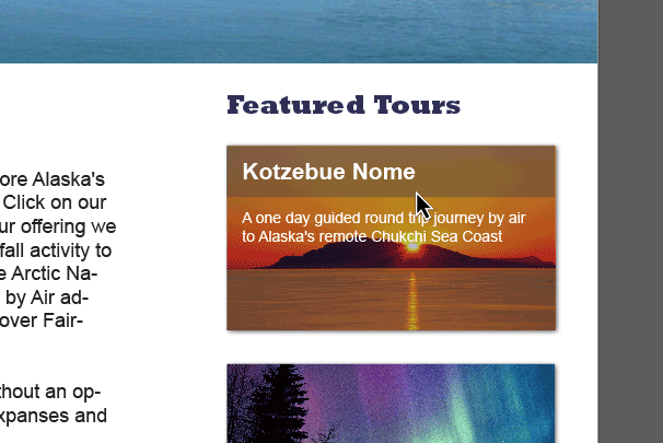
Subtle Interactions
Using CSS3, interactions like info-revealing rollovers and subtle link transitions are created. They add a level of polish and elegance for newer browsers, but don't detract from the experience on those less capable.